Decorating With The Color of the Year
The Color Whisperer shares her design advice on how to use this year's color, Marsala
Wednesday, February 4, 2015
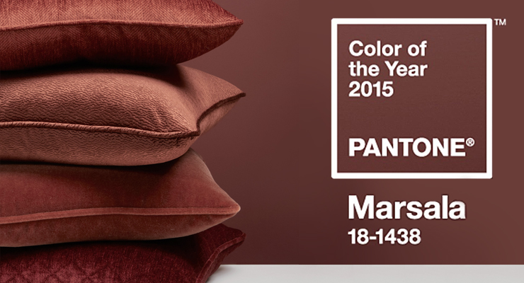
Every year, Pantone releases a designated “color of the year,” to inspire designers of all walks. The color for 2015 is Marsala, a rich ruddy wine color with brown undertones.
The name itself inspires an image of a romance, yummy food, and spicy wine. An elegant night out or maybe a cozy night by the fire. That is the allure of this color. Sophisticated yet homey. Flexible and versatile, to go casual and comfortable or elegant and formal.
It’s a color that we are already used to seeing in many forms of makeup and clothes. It’s feminine and can be translated well into many styles and elements of women’s clothing yet it also has enough ruddiness to have a masculine feel and be appropriate for men as well.
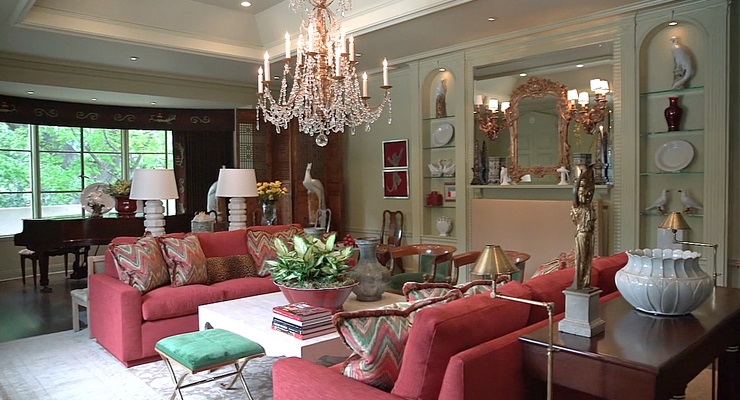
The color itself seems to have layers to it, red, maroon, brown and it lends itself to texture and layers in home as well as clothing. It pairs well with metals like bronzes and golds. It can be mixed with reds or oranges. Many people are pairing warm and cool colors together so you could also add in some cool colors like teal and green.
Marsala is a toned down version of last year’s Wild Orchid. The last few years have been bright, intense, colors. It’s time to calm down a bit. For many people 2014 was a very intense year and Marsala is a very calming nurturing color, meant to relax and rest a bit. It’s also very intriguing that we are going more toward the brown earthy look. There has been a great deal of interest in grays and cooler tones for several years. They are still going strong and warmer tones are getting more popular. A return to earthy colors may be in store for us. Earthy colors are grounding, stabilizing and calming.
Because of it’s earthy nature, it can be presented as a neutral. It is refreshing to see a neutral color that has so much depth and personality. While it’s lacking the striking drama of previous colors, it’s not meant to draw attention but blend together with many other tones. It’s gentle with a quiet strength that can enhance many settings. It is an easy way to add a pop of color to any environment, with pillows, pictures, accessories or even a whole wall. Don’t be afraid to use if for a whole room though as it can create a very elegant environment, and can be dramatic depending on what colors you add to the décor.
The red hues of Marsala automatically make it a great color for dining rooms and restaurants and you will see it gain popularity in eateries. It’s could be a great accent for a bedroom as well as it brings in romance and drama without the intensity of a brighter red which could keep you awake at night.
If this is your color, this is the year to decorate, buy those special clothing pieces, invest in accessories. Have some fun with it and experiment with it. While it is dark, it has a great deal of versatility. Create that cozy, warm and sophisticated haven for your home and add some spice to your life.
Jeanette Chasworth The Color Whisperer can be reached at 626.485.6354 and Jeanette@TheColorWhisperer.com. For more information about her work, please visit www.thecolorwhisperer.com.


